Case study
-
Feb 2024

Simplify the way teachers create online courses

4M+
users concerned
As a SaaS provider for schools, Edifice develops collaborative apps for teachers, students, parents, school staff, from primary to high schools.
3
main design iterations
Between Q4 2023 and Q1 2024, I dealt with this iterative and discovery project. This allowed the Product team to reframe and expand its strategy.
4
user profiles interacting
The initial goal was to simplify teacher-student assignment exchanges, but now it includes all docs exchanges between all user profiles.
4M+
users concerned
As a SaaS provider for schools, Edifice develops collaborative apps for teachers, students, parents, school staff.
1
regional client acquired
As a Product Designer at Edifice, in Q1 2024, I redesigned the app Wiki. The solution helped to acquire a new regional client.
7+
main features redesigned
As a Learning management system, Wiki enables mostly to create, edit, shate, move, duplicate, delete, restore pages and sub-pages.
2
targeted subscriptions /user/month
As a young organizer of events, La Maison Perchée gathers people and aims to convert users into active members.
40%
targeted event registration rate
Regularly, the registration rate was not optimised, and the subscription experience needs to be improved.
3
months to launch the portal
User tests, interviews, and prototyping activities integrated into development sprints enabled to build quickly the solution.

Challenges & Mission

1
Unclear problems statements
The team was uncertain about the pain points and their causes. I had to clarify them through user research.
2
Unclear goals
The team lacks of an action plan. I had to frame the project, define a roadmap with stakeholder buy-in, and lead the team.
3
Short time to launch the solution
I had to lead the design activities (user tests, interviews, prototyping) in a lean and flexible manner to maintain the development pace.
1
Lack of knowledge about users
The Product team lacked knowledge of user practices: what documents are exchanged, between whom, and how?

➜ I had to gather user insights and identify the most critical pain point to address in priority.
2
Change of scope and direction
The scope and product vision were unclear: should we merge, redesign, delete apps, or create a central app and rethink the homepage?

➜ I had to help the Product Manager and team choose a direction.
3
Too many apps unoptimised
Many user complaints about getting lost in the platform, with at least 5 apps for managing assignments & docs, none being truly efficient.


➜ Ultimately, I had to design a solution to simplify assignment exchanges.
1
Usability issues
The app was not at all intuitive. This project was part of my recruitment process: audit the app and improve its usability.
2
Lack of features and vision
The app did not allow the main uses that teachers needed. I went beyond the exercise by identifying and designing truly useful features for teachers.
3
Lack of consistency
UX & UI were not the same through the platform. Once hired, I had to integrate consistently the new features into the app and the platform.
JUMP TO THE RESULTS
Jump to the Results

Design process

Iteration #1 - Lean UX to create quickly a solution

Upon arriving at the company, the Product Manager tasked me with prototyping a solution within 3 weeks.
Empathise
1audit of apps & usage data
25tickets & feedbacks from User support
5ambassador-users (teachers) questioned
2high school students interviewed
Define & Ideate
1workshop
1vision-project connection
1bencmark
Prototype
4main user flows defined
+20wireframes hifi mocked

1. First 'Empathise' activities verified uses and pain points assumed

Teacher goals (for middle & high school)
Create & Distribute assignment
Track collection
🔴 Pain point
Correct & Note
Send grades and/or corrected papers & anser key
Student goals
Consult instructions
& material
Make the assignment
with or without
the platform
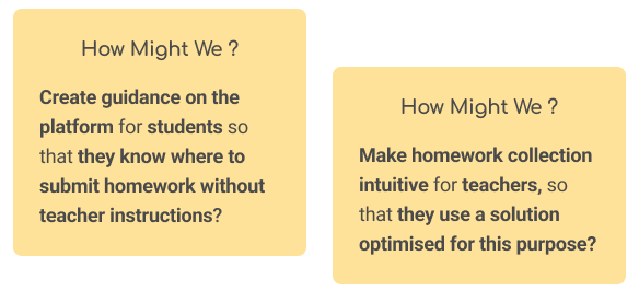
Submit / delete the assignment to replace it. 🔴 Instructions for submitting vary by teacher.
Consult grade
& correction
🧐 Other discovery: In primary schools, teachers are not allowed to give written homework, so usage differs from middle and high schools. ➜ A challenge for the platform, which uses the same apps for all levels.
Audit & data
Apps assumed
🟢 Strenghts
🔴 Weakness
Rack
Users can submit spontaneously any docs. Quite a lot of users & simple to use.
Lacks essential features such as file organisation and batch downloads.
Exercice
Covers many features: create, share interactive tests or exam topic templates, scheduling, tracking, and centralisation.
Not a lot of users, it lacks visibility and is complex due to many features.
Mailbox
Many users & simple to use.
Any centralisation nor tracking of documents.
Homework
notebook
The main tool for giving homework in a classroom.
Any collection of documents.
Files Space
Many users & it is intuitive to manage any docs there.
Students can see assignments that others have shared with the teacher.

2. Solution ideation workshop & choice of a direction

The workshop yielded diverse proposals such as renaming and overhauling the Exercise app, or reworking the Files Space, it implies:
No strategy emerges as the best,
Significant changes to existing apps would be complex and resource-intensive,
➜ Instead of the overhauls, the Product Manager and I suggested on a more feasible, flexible,and scalable approach: integrating a cross-cutting feature across multiple apps, through modals (excerpt below).
I benchmarked competitors and Drive softwares, to inspire the design of this feature. However, the Product team did not fully embrace this proposal because they had not been involved enough in defining the vision for this strategic project. This led to further iterations where Product Discovery truly began as a collaborative team effort.😊

Next iterations - Project reframed as a Discovery and team initiative

Due to the project's strategic impact, the product director extended the timeline to 6 weeks for further iterations
Empathise
2surveys & data analysis
5teachers interviewed
Define & Ideate
4product team workshops
1competitors benchmark
Prototype & Test
2solutions prototyped
4user tests

1. Surveys & data to identify trends and Interviews for a deep understanding

At this point, the Product Team aimed to identify trends about document types, applications used, use cases, and common issues among users.
Key findings:
◯  No dominant app for assignment management: practices vary significantly from teacher to teacher.
◯  No dominant types of materials: images, audio, written documents are exchanged.
 Common issue confirmed: not easy for students to submit homeworks.
◯  Primary school staff use Rack for administrative documents (e.g., parental permissions).
Some questions remained: how do teachers assign homework? How instructions are provided? What actions do they take?... To understand how they do in the classroom and the platform, I led some interviews with teachers from 2nd degree, and documented the key findings into 5 personas and 5 experience maps (excerpts below).
Key findings:
◯  New needs discovered: Teachers need to communicate before and after deadlines, control cheating, send frequent reminders, besides performing batch actions (e.g., downloading, printing).
◯  Students use their phones over computers (e.g., recording audio for language classes, checking instructions). We decided to prioritise a 'mobile-first' approach for the student experience.
◯  Some teachers prefer to correct assignments in the classroom, while others do so both digitally and in person final stage depriorised..

2. Workshops to diverge...

The product team could not rely on uses to define a direction, as they were divergent. So, we organised workshops to study the pros and cons of different directions.

... and to converge on a direction

Ultimately, we agreed with the 'First Use Case' and voted on a main direction with two alternatives:
◯  Redesign Rack to capitalise on its many users
◯  Deplace and improve features from Exercice (collections, tracking...)
◯  Add a 'Comment' features to cover the conversation needs
◯  Delete "Spontaneous deposits' feature to focus only on assignments beetween teachers and students OR keep it to enable all documents exchanges among all user profiles.

3. Prototype the alternatives....

I created a moodboard of competitors to gather inspiration. Then, I converted user needs into a list of features prioritised, approved by the Product Manager. To address usability issues, I redefined the user flows using the 'Job to be Done' method. Finally, I tested different screen layouts and navigation through wireframes and mockups (excerpts below).
For example, to simplify navigation for the 'Consult and Submit Assignment' feature for students, I initially tried an 'expand/collapse' layout but ultimately favored a 'tab navigation' with fewer tabs for better responsiveness.

... and user tests on prototypes

I had a short deadline to recruit users and conduct tests. I focused the scenario tests to verify our main hypotheses and concerns: Are the primary user problems addressed? Is the student effectively guided through submitting assignments? Is it easy for teachers to collect and centralise students' assignments? Does the 'Collecting' feature integrate well with 'Spontaneous submission'?
The main user flows were successfully realised by testers, even by those unfamiliar with the platform. This reassured the Product team, enabling them to choose the alternative that allows document exchange among all user profiles.

Lean UX to launch quickly a user friendly portal

Empathise & Define
6usability tests and interviews
1atomic user research analysis
4roadmaps & business processes defined
Prototype & Test
20+responsive mockups
5user tests on prototypes
2adjustment iterations
Launch & Product management
10+user stories wrote & designed
12+agile meetings
I detailed my design process and results in the video below (please, put subtitles for non-French speakers).

I. Understanding and Defining the problem

My process - 1st part

UI & UX audit & Field observation

Beyond the outdated, inconsistent, and non-ergonomic design, I noticed conflicting product visions. Then, I used my observations of teachers and my own teaching experience (in an elementary school in Thailand) to perform typical teacher actions in Wiki. I summarized my findings in a criticality matrix: 🔴 Blocking ; 🟠 Annoying.

🟠 1. Conflicting visions in Wiki descriptions
-
In the empty state, Wiki is for creating encyclopedia ➡️ flat content and no sub-sections.
- In the exercise brief, Wiki is for creating courses ➡️ deep content with sub-sections.

🔴 2. Lack of flexibility and structure
Pages are not displayed in the order of a course, and it prevents users from reordering pages or creating sub-sections.
2. 'Page list' screen: the page are in the order of their date creation

🔴 3. Lack of an automated table of content
The user must manually create a hyperlink for each page to build a table of contents, whereas automatic tables of contents are standard in most software tools.
3. To create hyperlinks for each page, we must use the 'Linker' modal, which is hidden in the Rich editor and not intuitive.

Empathy map & First Use case

I created an empathy map to communicate my research findings. Then, I summarized the problem by defining the First Use Case (method from Discovery Discipline book).

II. Ideation of solutions and final prototype

My process - 2nd part

Benchmark

I analysed EdTech players like Open Classrooms and Coursera, but I focused mainly on office software tools such as Notion, OneNote, and Coda, because they offer great flexibility for content creation.

Key findings

This analysis led me to propose adding a 'sub-pages' and a drag-and-drop features to improve course organisation, reorganizing and nesting pages. I focused on the simplest practices and the UX writing of these tools, avoiding the complexities of Notion, which has a less intuitive learning curve.
No items found.

Results

A solution meeting user's needs

A centralised experience for teachers

A 'mobile first' and 'multimedia' experience for students

To conclude, thanks to the Product discovery, the initial opportunity evolved to handle all types of document exchanges, spontaneous or organised into collections, among all user profiles. I succeeded in dealing with complex challenges:

◯ Maintaining simplicity as much as possible in a solution that is now multi-functional and flexible,
◯ Enhancing team alignment and validation,
◯ Presenting multiple solutions, enabling informed recommendations to the Product team,
◯ Gaining deeper insights into the teaching profession, improving comprehension of user needs in EdTech,
◯ Considering responsive design early to ensure optimal solutions for responsive web apps.

First proposal with high fidelity wireframes

My solution proposal before my recruitment - 1

My solution proposal before my recruitment - 2


Constraints to consider & Solution comparison

This wireframe introduced significant improvements, leading to my recruitment and the project's prioritisation on the roadmap. However, once recruited, I had to deal with key constraints, such as many features to place, while avoiding visual overload for teachers and students, with limited skills.

So, I created multiple mockups and selected the two best solutions. Then, I documented and presented their pros and cons to the Product team. For one of them, I suggested new components not yet part of the Design System, so they introduced uncommon behaviors across applications. Their implementation would have required to add actions in the backlog: assessing their integration into the platform, and leading user tests to know which solution engage more, but time constraints prevented it at this moment. Ultimately, we opted for a vote to make the final decision.

Prototyped solution
Prototyped solution

Excerpt of the Design system
Excerpt of the responsive version


To conclude, by going beyond the initial exercise and proposing a course-centered product vision, I designed a streamlined Learning Management System adapted to education. This led to the Product team buy-in, advanced the project to development, and contributed to acquiring a regional client. The solution now simplifies page and subpage creation, reordering, and ensures a clear, structured table of contents.

No items found.

No items found.